Brand Consistency Checklist: Visual Identity Guide
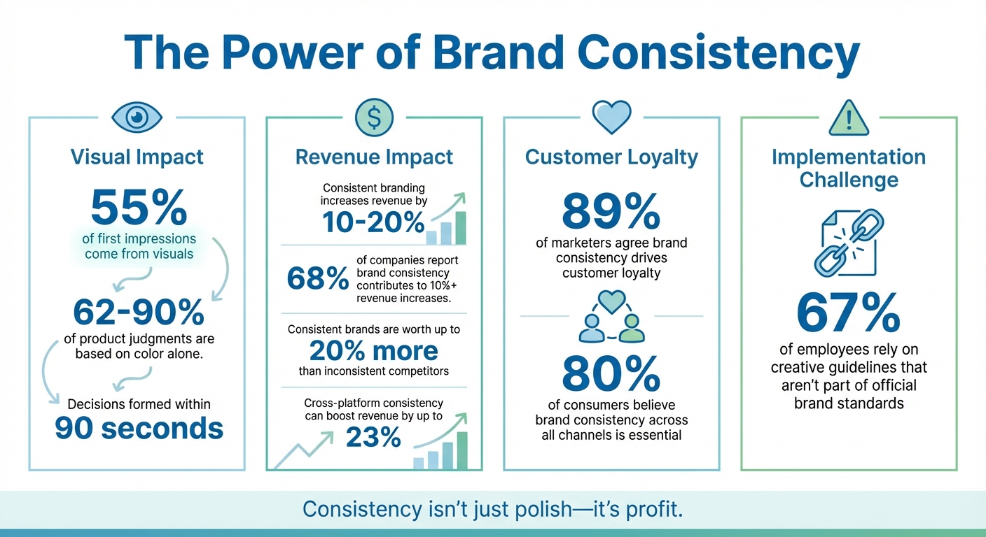
Your brand's success hinges on consistency. From logos to colors, maintaining a unified look across platforms builds trust, boosts recognition, and drives revenue. Research shows 55% of first impressions come from visuals, and consistent branding can increase revenue by 10%-20%. Yet, scattered assets and misaligned designs often undermine these efforts.
Key Takeaways:
- Define your brand’s purpose, mission, and values to guide decisions.
- Use a clear logo family, color palette, and typography rules.
- Centralize assets in a cloud-based library for easy access.
- Leverage AI tools like IllustrationsAI to quickly create on-brand visuals.
- Regularly audit materials and train teams to ensure compliance.
Consistency isn’t just about looking polished - it’s about creating trust and lasting impressions. With the right tools and practices, your brand can stand out and stay memorable.
Brand Consistency Impact: Key Statistics on Revenue and Customer Loyalty
How to Create Brand Guidelines for Consistent, Easy Marketing
Brand Foundation Checklist
Before diving into visual design, it’s crucial to establish a clear foundation for your brand. This means documenting your purpose, mission, vision, and core values. Think of these as your guiding principles - your North Star - that shape every decision, from visuals to messaging. Without this groundwork, your brand risks creating inconsistent visuals that confuse rather than connect with your audience.
Define Core Brand Elements
Start by defining your brand’s purpose, mission, and vision. Your purpose answers the “why” behind your brand’s existence - beyond just making a profit. Your mission is the goal you’re actively working toward, and your vision paints a picture of what success looks like in the world.
Next, outline your core values, the principles that guide your team’s actions and decisions. These values shouldn’t just be buzzwords; they should influence everything from your workplace culture to how you engage with customers. Research supports this: consistent branding can drive revenue growth by 10% to 20%, and 68% of companies report that brand consistency contributes to revenue increases of 10% or more. Why? Clear, consistent values help customers understand what to expect, building trust and loyalty.
To make this actionable, share these elements with your team using a centralized document or brand portal. This ensures that everything you create - whether it’s a social media post or product packaging - stays aligned with your brand identity.
Identify Target Audience and Positioning
Effective visuals begin with understanding who you’re speaking to. Create detailed buyer personas that capture your audience’s pain points, interests, and behaviors. Adding memorable nicknames to these personas can make them feel more relatable and human.
Your brand positioning defines what sets you apart from competitors. This unique value proposition should directly influence your design choices, from your logo to your photography style. For instance, if your brand is positioned as premium and sophisticated, your color palette and typography should reflect that. And here’s a compelling stat: people form opinions about products within 90 seconds, with 62% to 90% of that judgment based on color.
To keep your audience insights up-to-date, use a Customer Data Platform (CDP) to merge data from multiple touchpoints into a single source of truth. This approach ensures that your visuals resonate with your audience’s expectations, helping you build recognition faster and avoid alienating potential customers.
Set Tone and Personality Guidelines
Your brand’s voice should feel like it’s coming from one person, not a committee. Define your tone and personality traits to guide how you communicate across all platforms. Be specific - don’t just say your tone is “professional.” Clarify whether you use contractions, humor, or slang. Use spectrums (e.g., formal vs. informal) to show how your tone might shift between platforms like LinkedIn and Instagram.
Consistency here is key: 89% of marketers agree that brand consistency is the main driver of customer loyalty. When customers encounter the same personality across your website, emails, and support channels, it builds trust.
Document these guidelines in a centralized style guide that’s accessible to your entire team. Include examples of approved and unapproved language, grammar preferences (like favoring active voice), and platform-specific nuances. This guide empowers everyone - even non-designers - to create content that’s on-brand without needing constant approvals. Plus, consistent brands are estimated to be worth up to 20% more than their inconsistent competitors, making this documentation a smart investment for your business.
With these foundational elements in place, you’re ready to bring your brand’s identity to life through a cohesive visual language.
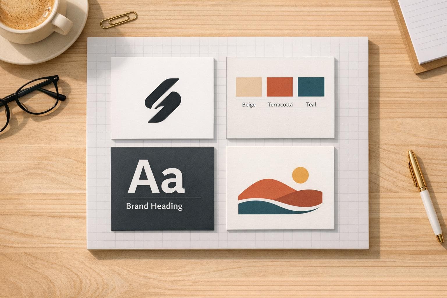
Visual Identity Design Checklist
Once your brand's foundation is in place, it's time to craft visuals that your audience will instantly recognize. Your logo, color palette, typography, and imagery should all work together to create a unified and memorable identity.
Logo Design and Usage Rules
Your logo needs to perform well across all mediums. Start by designing a logo family: a primary version for general use, a simplified version for small spaces, and an icon-only version for things like social media avatars or favicons.
Establish clear space around your logo - a buffer zone where no other elements can intrude. Use a part of your logo, like its height or width, as the measurement unit for consistency. Define minimum sizes to ensure readability, such as 0.75 inches for print or specific pixel dimensions for digital use. If your logo becomes illegible at 0.5 inches, document the smallest size that works.
Prepare color variations, including full-color, monochrome, and inverse versions for different backgrounds. Save master files in vector formats like AI, EPS, or PDF for scalability, and create raster files (PNG, JPG) for web use. Stick to CMYK for print and RGB or HEX for digital screens.
"A strong visual identity isn't pretty; it's purposeful, helping you communicate who you are, no matter the medium." – Josh Ritchie, Cofounder, Column Five Media
Create a "do not" list to prevent misuse of your logo. Examples might include avoiding stretching, rotating, adding shadows, or placing it on low-contrast backgrounds. This ensures your brand's appearance stays professional and consistent.
From here, refine your color palette to further define your visual identity.
Color Palette and Accessibility
Colors are powerful. Research shows that people form judgments about products within 90 seconds, and 62% to 90% of that decision is based on color. Build your palette with 1–3 primary colors that define your brand, 2–4 secondary colors for accents, and neutral shades (black, white, gray) for backgrounds and text.
Document precise color values in multiple formats to avoid inconsistencies: HEX codes for web, RGB for screens, CMYK for print, and Pantone/PMS for exact color matching in professional printing. This ensures your brand colors appear consistent, whether on a billboard or a smartphone screen.
Accessibility is non-negotiable. Ensure all color combinations meet WCAG contrast standards for readability. Tools like the Material Theme Builder or Figma's "Foundation: Colour generator" plugin can help you create accessible color systems. Include tonal variations (lighter and darker shades) to give designers flexibility while keeping your visuals cohesive.
Always test your colors on mobile devices in different lighting conditions to ensure they look great everywhere.
Typography Guidelines
Typography is more than just fonts - it’s about guiding the reader through your content. Most brands do well with just two or three typefaces: one for headlines and another for body text.
"Typography should be influenced by the shape and style of your logo, as you always want a complementary and cohesive look." – Column Five Media
Set rules for font weights (like bold or light), line spacing (about 150% of the font size for readability), and letter spacing. Define a hierarchy with specific sizes for headings (H1, H2, H3) and body text. Research shows larger fonts can create stronger emotional connections, so don’t hesitate to use bigger sizes for headlines.
Choose web-safe alternatives for custom fonts to ensure your content displays correctly across all devices. For example, if your headline font is custom, select a similar standard font like Arial or Helvetica as a fallback.
| Element | Recommended Specifications |
|---|---|
| Primary Typeface | Bold and eye-catching, reflecting your brand personality for headlines (H1, H2) |
| Secondary Typeface | Simple and highly legible, ideal for body text and smaller sizes |
| Web-Safe Fallback | Standard fonts like Arial or Helvetica for consistent rendering in digital or email formats |
Set minimum font sizes for both print and digital use to avoid unreadable text in small spaces like footers or ads. Test your typography on high-resolution print materials and small mobile screens to ensure it works in every scenario.
With typography in place, focus on imagery to complete your brand's visual identity.
Imagery and Illustrations
Imagery is a key part of your brand's story. Define a photography style - are your visuals bright and airy, or dark and dramatic? Decide if you’ll feature lifestyle shots with people or clean product photography on plain backgrounds. Be specific about lighting, composition, and subject matter.
For icons and illustrations, consistency is critical. Use tools like IllustrationsAI to maintain a unified style across all assets. Decide if your illustrations will be flat or dimensional, minimalist or detailed, and whether they’ll use your full brand palette or just a subset.
Create a reference library of approved images and include examples of what not to do alongside the approved ones. This helps everyone from freelancers to internal teams understand your expectations without endless revisions. Remember, 80% of consumers believe brand consistency across all channels is essential, and your imagery plays a big role in achieving that.
Implementation and Asset Management
Defining your visual identity is just the beginning; the real challenge lies in making sure everyone sticks to it. A recent study found that 67% of employees rely on creative guidelines that aren't part of their company's official brand standards. This highlights a common problem: even the most polished brand guidelines are useless if they're buried in an obscure PDF. Here's how you can make your visual identity part of everyday operations.
Centralized Asset Library
Start by gathering all your current brand assets - logos, color codes, typefaces, and images. Outdated materials? Get rid of them to avoid accidental use. Next, upload everything to a cloud-based Digital Asset Management (DAM) system or brand portal. This ensures your team always has access to the latest, approved versions.
Organize your assets into clear categories. For example, create collections tailored to specific departments, regions, or projects, so frequently used items are easy to find. Use user permissions to control access: your sales team might only need to view presentation templates, while your marketing team could require full editing capabilities.
"A brand isn't built once - it's built every day. And your Brand Kit is the infrastructure that makes consistent brand building possible." – David Vaassen, Brandkit
To make customization easier without compromising brand standards, store editable templates in your library. Lock key elements like fonts, colors, and logos to keep everything on-brand. Using Smart CDNs for hosting images can streamline updates - change a master file, and it will automatically refresh across websites and email campaigns. Schedule quarterly audits to add new materials and retire outdated ones.
Template Creation for Different Platforms
With your assets centralized, the next step is standardizing their use across various platforms. Develop templates tailored to specific channels. For digital content, use RGB/HEX at 72–144 DPI, and for print, stick to CMYK/Pantone at 300+ DPI. Common needs include templates for social media posts, email signatures, presentations, and business cards.
Lock essential brand elements in design tools like Adobe InDesign or Figma to prevent accidental changes. Include a "Do's and Don'ts" guide that shows correct logo placement and appropriate color combinations for different backgrounds. For platforms that don’t support your primary fonts, specify fallback options to maintain consistency.
Review and Compliance Processes
A consistent application of your brand assets strengthens your identity across every interaction. This requires a solid review process to uphold the quality and consistency outlined in your brand guidelines.
Assign specific roles for pre-publication approvals. Use a "Pending" status for new uploads, ensuring assets aren’t available for use until a designated brand guardian gives the green light. Automated notifications can alert creative leads when their approval is needed.
For external collaborators like agencies or freelancers, provide "Guest Upload" links that route their work directly into your approval queue. Conduct quarterly reviews of customer-facing materials - such as social media profiles, sales decks, and websites - to catch and correct inconsistencies early. Establish feedback channels where employees can report issues with branding or suggest improvements to the guidelines.
Consistent branding across platforms can boost revenue by up to 23%. To make this happen, include brand toolkit training in onboarding for all new hires - not just those on the creative team.
Using AI for Brand Consistency
Creating design assets manually can be a time-consuming process, often taking weeks to complete. AI platforms, however, drastically reduce this timeline to mere hours, all while adhering to the visual standards you've established. By training AI to understand your brand's unique visual language, you can generate assets that seamlessly align with your in-house creative team's work. A great example of this efficiency is how IllustrationsAI customizes each asset to fit your brand's specific style.
Custom Illustration Generation with illustrationsAI
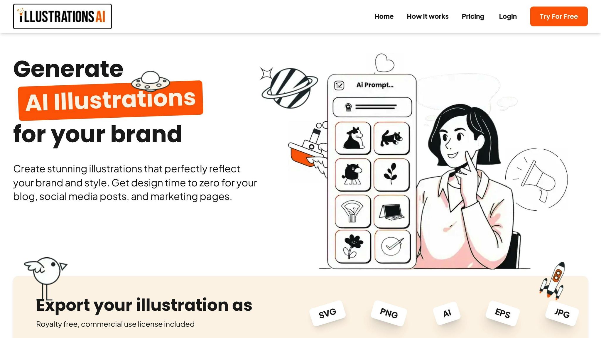
With IllustrationsAI, you can upload your existing brand visuals - such as social media posts, product images, and website banners - to teach the platform your design preferences. This includes your color palette, lighting choices, textures, and composition patterns. Once trained, the AI generates illustrations that perfectly match your brand’s identity.
The platform provides royalty-free, commercial-use illustrations in various formats, including SVG, PNG, AI, EPS, and JPG. This means you can instantly use these assets across digital and print channels without needing to hire external designers or spend time adjusting generic stock images. By uploading high-performing content, you ensure the AI continues to produce visuals that are consistent with your brand.
Predefined Styles and Custom Packs
Not ready to train a custom style? No problem. IllustrationsAI offers a variety of predefined styles that are ready to use. These pre-built options are ideal for teams needing professional visuals quickly. Additionally, you can access custom illustration packs tailored to specific themes. These are particularly useful for campaigns or projects requiring a cohesive visual approach.
Even the entry-level Hobby plan includes access to these predefined styles and packs, ensuring that you can create brand-aligned visuals from the start. Whether you choose custom or predefined illustrations, the platform supports export to formats suitable for web, social media, email, and print.
Plan-Based Features for Scalability
IllustrationsAI offers tiered pricing based on your illustration volume and the number of custom styles you require. Here's a breakdown of the available plans:
- Hobby Plan: $36/month (billed annually), includes 25 AI illustrations and 1 custom style per month. Perfect for solopreneurs or small businesses with minimal content needs.
- Basic Plan: $68/month, offering 75 illustrations monthly.
- Pro Plan: $196/month, providing 500 illustrations and 3 custom styles, ideal for teams producing regular visual content.
- Business Plan: $596/month, designed for enterprise-level operations with 1,500 illustrations and 5 custom styles per month. This plan is great for large teams managing multiple markets or product lines.
All plans include commercial-use licensing and export options for major file formats, so you only pay for what aligns with your volume and style requirements.
"The more precisely you document your visual standards, the more reliably the platform can generate on-brand outputs at scale." – illustration.app
Before choosing a plan, consider your monthly illustration needs. For example, if you’re creating 10–15 social media posts weekly along with occasional email graphics, the Pro Plan offers enough flexibility to meet your demands. For teams needing over 300 illustrations per month, the Business Plan ensures uninterrupted workflows.
Conclusion and Key Takeaways
Staying consistent with your brand isn't just about looking polished - it’s about building trust and making your brand instantly recognizable. Research backs this up: consistent branding can boost revenue by 10% to 20%, and 89% of marketers believe it’s a major factor in winning customer loyalty. By following a clear checklist - from defining core elements to centralizing your assets - you can ensure your brand stays cohesive across all platforms.
Thanks to AI, what used to take weeks can now be done in hours. Tools like IllustrationsAI are designed to streamline this process. By learning your brand’s visual language, it can create high-quality assets that align perfectly with your identity. Whether you're a solopreneur starting with the Hobby plan at $36/month or part of a large enterprise managing multiple product lines on the Business plan, the platform adapts to your needs while keeping your branding intact. This flexibility is a key part of maintaining consistency as your brand grows.
While AI can handle asset creation, disciplined management is what ensures long-term consistency. Centralizing your visual standards and approved assets in one place is essential for keeping your brand identity intact. Lock in critical elements like logo placement and brand colors with templates, but leave room for your team to create independently. Regular audits - whether quarterly or bi-annually - help you catch and correct inconsistencies before they become widespread.
FAQs
Maintaining brand consistency is essential for building trust, recognition, and a strong identity. These factors directly influence both customer loyalty and revenue. When your messaging and visuals are consistent across platforms, it creates a sense of familiarity that helps customers feel more connected to your brand.
In fact, consistent branding has been shown to increase revenue by 10–20%. It boosts credibility and makes it easier for customers to choose your brand over competitors. Plus, businesses with a well-maintained brand identity often hold greater market value. By ensuring that design elements like logos, colors, and typography are aligned across all touchpoints, companies can create loyalty and stand out in even the most competitive industries.
Maintaining a cohesive visual identity starts with having the right tools and clear guidelines in place. AI-driven tools can make it easier to create visuals that align with your brand, ensuring that elements like logos, color schemes, and typography stay consistent across all platforms. This is especially important in areas like digital marketing and e-commerce, where a unified brand presence can make a big difference.
Another key resource is a brand style guide. Think of it as a go-to manual that lays out how to use your logo, fonts, colors, and even your brand’s tone of voice. It helps ensure that everyone on your team is on the same page when representing the brand. To take it a step further, incorporating checklists or scheduling regular brand audits can help spot any inconsistencies and keep your visual identity in sync with your overall brand strategy.
AI takes the hassle out of creating consistent brand visuals by quickly generating designs that match your brand's style. From colors and typography to imagery, it ensures your brand identity stays aligned across platforms like social media, websites, and advertisements.
Thanks to AI, businesses - big or small - can create polished, professional visuals without needing hefty budgets or massive resources. This means you can maintain a cohesive visual identity while cutting down on both time and effort.