Complete Guide to Building a Visual Brand Identity
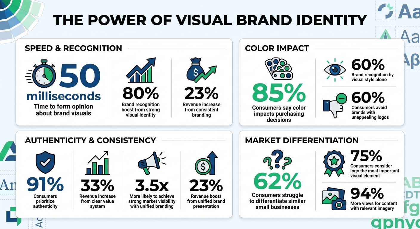
First impressions matter. It takes just 50 milliseconds for someone to form an opinion about your brand's visuals. A strong visual identity - logo, colors, typography, and imagery - can boost recognition by 80% and even increase revenue by 23%. Consistency across all platforms makes your brand memorable and trustworthy.
Key takeaways:
- Logos: Simple, versatile, and memorable designs are essential.
- Colors: Influence emotions and decisions; 85% of buyers say it impacts their choices.
- Typography: Sets the tone; stick to 2–3 fonts for clarity and hierarchy.
- Imagery: Aligns with your brand’s personality and tells its story.
To succeed, define your brand's mission, understand your audience, and differentiate from competitors. Tools like IllustrationsAI simplify creating visuals, saving time and ensuring consistency. Follow a brand consistency checklist to document guidelines and centralize assets, maintaining a unified look across teams. The result? A recognizable, trusted brand that stands out.
Visual Brand Identity Statistics: Impact on Recognition and Revenue
Build a Brand from Scratch - Brand Identity Design Process
Building the Foundation of Your Visual Brand Identity
Before diving into colors or drafting logos, take a step back and ask yourself three essential questions: What does your brand represent? Who is your audience? What are your competitors doing? These answers will shape a visual identity that not only connects with people but also stands out in a crowded market.
Define Your Brand's Mission, Vision, and Values
Your mission and vision statements are the backbone of your visual identity. They guide every design decision, while your core values serve as the moral compass for your creative team. When you establish what your brand embodies - whether it’s innovation, trust, or inclusiveness - you can turn these big ideas into visual elements that are consistent and recognizable.
Here’s a key stat to keep in mind: 91% of consumers prioritize authenticity, and having a clear value system can increase revenue by as much as 33%. To get started, gather your stakeholders for workshops and document your principles in a branding brief. This ensures every design choice aligns with your business goals. Mood boards can help translate abstract values into tangible visuals. For instance, if trust is a core value, you might explore shades of blue, as it’s known to evoke feelings of reliability and security.
Identify Your Target Audience
Design isn’t one-size-fits-all. To create visuals that resonate, you need to know your audience inside out. Research their demographics, psychographics, and behaviors, and don’t hesitate to interview customers and stakeholders to gather deeper insights.
Consider these numbers: 85% of consumers say color plays a major role in their buying decisions, and 60% recognize a brand purely by its visual style. On the flip side, 60% might avoid a brand if its logo is unappealing. To avoid these pitfalls, develop detailed buyer personas that reflect your audience. These personas help guide your design choices, ensuring they align with the preferences and expectations of your target market. Adobe sums it up well:
"The better your designers and writers know the brand's audience, the better they'll communicate with them."
Ask yourself: What kind of experience does your audience expect? Should your brand feel playful or professional? Dive into specifics like their industry, location, age range, income level, and shopping habits. If you’re unsure about your design direction, test your visuals with people unfamiliar with your brand to gauge their reactions and refine your approach.
Analyze Your Competitors
Studying competitors isn’t about copying their style - it’s about finding a way to stand apart. By analyzing their visual strategies, you can spot trends in color palettes, typography, and imagery within your industry. This helps you avoid blending in and instead create a distinct identity that grabs attention.
Why does this matter? Because 62% of consumers say they struggle to differentiate between products from similar small businesses. By understanding the "mental space" your competitors occupy, you can carve out your own niche and express it visually. A classic example is Coca-Cola and Pepsi, which use red and blue, respectively, to create instant brand recognition and differentiation.
Take a close look at 3–5 of your direct competitors. Document their logos, fonts, color schemes, and imagery. Pay attention to the emotions they aim to evoke - whether it’s trust, excitement, or luxury - and decide if your brand should align with or disrupt these cues. As Natalie Wiley from Printivity points out:
"A huge part of strategic positioning is knowing who you're up against so you can make decisions that distinguish your business and set it apart."
Core Components of Visual Brand Identity
Once you've established the foundation of your brand, it's time to focus on the visible elements that bring it to life. These components - your logo, color palette, typography, and imagery - are what people instantly recognize and associate with your business. When designed with care and applied consistently, these elements can boost brand recognition by up to 80% and even contribute to a 23% increase in revenue. Together, they create a cohesive and memorable identity that reflects your brand's personality and values.
Logo Design: The Face of Your Brand
Your logo is often the first thing people notice about your brand, and 75% of consumers consider it the most important visual element. A great logo should be simple, memorable, and versatile. It needs to look just as good on a small business card as it does on a massive billboard. As Adobe's Certified Professional Team explains:
"A well-designed logo should be simple, distinctive, and relevant to the brand's value and offerings."
Stick to clean shapes and a limited color palette to ensure clarity. Create multiple versions of your logo: a primary design for larger spaces, a secondary version for tighter layouts, and an icon-only option for social media or website favicons. Always design in vector format using tools like Adobe Illustrator to maintain quality at any size. And don’t skip the testing phase - getting objective feedback is crucial to refining your design.
Color Palette: Setting the Mood
Colors do more than just make your brand look good - they shape how people feel about it. In fact, 85% of consumers say that color is a major factor in their purchasing decisions. Your color palette should include primary, secondary, and accent colors, with each one clearly defined using HEX, RGB, and CMYK codes to ensure consistency across all platforms.
Different colors evoke different emotions: blue conveys trust, red sparks excitement or urgency, green symbolizes growth and health, while black and purple often suggest luxury. Think about the emotions you want your brand to inspire and choose colors that align with that vision. Don’t forget about accessibility - high-contrast combinations can make your designs more inclusive and easier to read.
Typography: Communicating Style and Clarity
The fonts you use say a lot about your brand. Serif fonts like Times New Roman give off a sense of tradition and reliability, while sans-serif fonts like Helvetica feel modern and energetic. To keep things clean and professional, stick to two or three typefaces: one for headlines and one or two for body text. This creates a clear visual hierarchy and ensures your message comes across effectively.
Make sure your typography works well across both digital and print formats. Sans-serif fonts often perform better on screens, while serif fonts can be easier to read in printed materials. Document font sizes and weights to maintain consistency. As Adobe puts it:
"Just as we're more inclined to trust friends with stable, consistent personalities, we're more likely to trust brands that always look and feel the same."
Imagery and Graphics: Expressing Brand Personality
The images and graphics you choose play a key role in telling your brand's story. Decide whether your photos should feel candid or posed, and whether your icons should be minimalist or detailed. Research shows that content with relevant imagery gets 94% more views than content without it.
If inclusivity is a core value for your brand, make sure your visuals reflect that by featuring diverse representations. For a sleek and modern vibe, consider a minimalist approach, similar to what brands like Apple or Nike are known for. To keep your visual style consistent, creating a mood board can be incredibly helpful. It allows you to see how all your elements - imagery, colors, typography - work together to create a unified look across every touchpoint.
Using AI Tools to Create Brand Visuals
In the past, creating visuals that matched a brand's identity often meant weeks of back-and-forth revisions and expensive photoshoots. But now, AI tools have changed the game. The real advantage isn't just how fast things get done - it's that these tools can learn your brand's specific style. By uploading your brand assets, the AI picks up on your unique textures, colors, lighting, and compositions. This eliminates the need for complicated design software or lengthy project briefs.
This speed and accuracy are at the heart of how IllustrationsAI transforms the visual design process.
How IllustrationsAI Simplifies Design
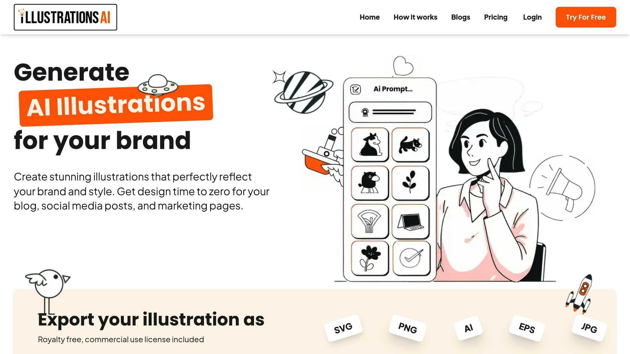
IllustrationsAI works by analyzing your existing brand materials. Upload a few reference images that showcase your brand’s visual style, and the platform generates illustrations that align perfectly with your identity. Pair it with SocialPilot's AI Pilot to auto-generate and schedule matching social posts.
As design expert Miss Chatz puts it:
"AI is fast, but it's not perfect. AI generates options, not final products... AI gets you 80% of the way, and you complete the remaining 20%."
This approach is particularly helpful for small teams or individuals who need polished visuals without relying on a full-time design team. One thing to keep in mind: when transferring assets from AI tools to print materials, always double-check your HEX or CMYK color values. These tools often optimize for RGB screens, which can cause slight color shifts.
With these features in mind, let’s look at the pricing plans that cater to different design needs.
IllustrationsAI Plans and Features
IllustrationsAI offers four pricing tiers, each designed to fit different user requirements. Plans are billed annually, offering better value for long-term use:
| Plan | Monthly Price | AI Illustrations (Credits) | Custom AI Styles | Best For |
|---|---|---|---|---|
| Hobby | $39 | 25 | 1 per month | Individuals exploring the platform |
| Basic | $74 | 75 | 1 per month | Small teams with regular design needs |
| Pro | $220 | 500 | 3 per month | Professionals managing multiple brands |
| Business | $636 | 1,500 | 5 per month | Enterprises with high-volume demands |
All plans include commercial usage rights, access to predefined styles and illustration packs, and the ability to export in both image (PNG, JPG, WebP) and vector formats (SVG, AI, EPS). For those juggling multiple brands or running campaigns with varying styles, the Pro and Business plans offer the flexibility and volume needed.
Practical Applications for IllustrationsAI
IllustrationsAI doesn’t just generate visuals; it ensures they stay true to your brand’s identity across all marketing materials. Whether you’re creating blog headers, social media graphics, pitch deck visuals, or email marketing assets, the platform keeps your visuals consistent and professional. For example, it can generate Instagram story graphics, LinkedIn post designs, or even variations of a single concept tailored for different platforms like emails or websites.
Consistency in visuals isn’t just about aesthetics - it’s about impact. A Nielsen study found that brand recall contributes to 38.7% of brand lift in emerging media. By maintaining a recognizable and cohesive visual identity, tools like IllustrationsAI play a key role in reinforcing your brand’s presence across every touchpoint.
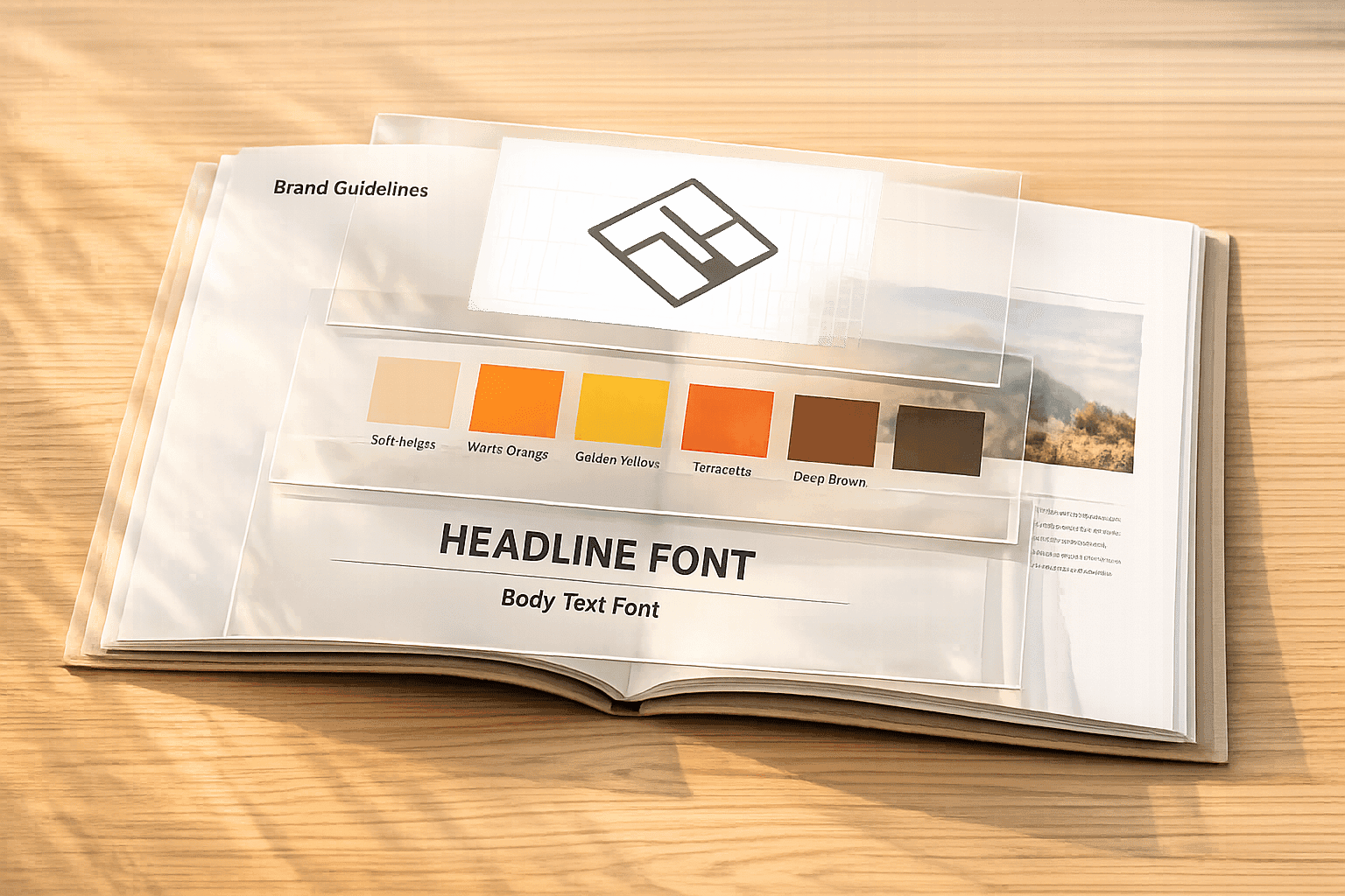
Creating and Implementing Brand Guidelines
Without clear, documented guidelines, maintaining brand consistency becomes a challenge. And that consistency matters - a unified brand presentation across all platforms can boost revenue by 23%. But this only works if everyone on your team understands and follows the rules.
Documenting Brand Rules
Think of your brand guidelines as a practical tool, not a static document that gathers dust. Start with the essentials:
- Define your primary and secondary logos, including exact spacing requirements and minimum sizes with pixel-perfect measurements.
- Lay out your color palette with precise Hex codes for web, CMYK values for print, and RGB for digital use.
- Establish a typography hierarchy, specifying which fonts are for headlines and which are for body text.
- Include a "Do's and Don'ts" section, outlining proper logo usage. For instance, prohibit stretching, altering colors, or placing logos on low-contrast backgrounds.
Many brands are ditching static PDFs in favor of dynamic, web-based brand portals. Why? Static documents quickly become outdated, leading to confusion and outdated assets floating around. A web-based portal, on the other hand, acts as a single source of truth. Teams can download the correct logo files, access the latest color codes, and view updated templates in real time. Once your rules are documented, test your designs across platforms to ensure consistency.
Testing Designs Across Platforms
After defining your visual elements, make sure they work seamlessly across different formats. Test your logo at various sizes to confirm it stays legible. Check your color palette for contrast and accessibility, especially for color-blind users. This matters because 80% of consumers say consistent branding across all channels builds trust. Also, when switching between digital and print, double-check your color codes to prevent any unexpected changes in appearance.
Maintaining Consistency Across Teams
Even the best guidelines are useless if your team doesn’t follow them. Share your brand portal with everyone involved in content creation - designers, marketers, external agencies, and even non-creative staff. Consistent branding makes a real difference: brands with a unified presentation are 3.5 times more likely to achieve strong market visibility. This visibility happens when every team member is equipped to stay on-brand without unnecessary delays.
To make this easier, create locked templates for common tasks like social media posts, email signatures, and presentations. These templates ensure that key elements - like logo placement, fonts, and colors - stay consistent while still allowing for some customization. For example, Bosch streamlined 17 different sets of brand guidelines and 60 variations of a single "home" icon into one centralized platform. This gave their global teams easy access to unified specifications for everyday work. Similarly, Leonardo Hotels implemented a template system that allowed local teams and agencies to produce content at scale while adhering to master brand standards.
Lastly, set up approval workflows and conduct regular audits of marketing materials across departments. Use your digital asset management system to track which assets are most frequently used. This can help pinpoint which teams might need extra support to stay on-brand.
Conclusion
To wrap things up, creating a visual brand identity is about much more than just looking good - it's a thoughtful process rooted in strategy. It all begins with a solid foundation: defining your mission, understanding your audience, and taking stock of the competitive landscape. As mentioned earlier, these core insights form the backbone of every design decision. Maria Rodriguez from Magnt captures this perfectly:
"Strategy comes first, design follows. The most beautiful logos and color palettes won't help if they don't align with your business strategy."
Once your visual elements are established, consistency becomes the key to standing out. Brands that maintain a unified look are 3.5 times more likely to grab attention and can even boost revenue by 23%. It’s not about chasing perfection - it’s about showing up repeatedly. With 60% of consumers recognizing brands based solely on their visual style, every single interaction counts.
Tools like IllustrationsAI make this process more manageable by automating the creation of brand assets. Instead of starting from scratch for every social media post or email header, you can train the AI to generate visuals that align with your brand. Starting at around $38 per month (when billed annually), this tool provides commercial-use illustrations in formats like SVG, PNG, AI, EPS, and JPG - no design expertise required.
Centralizing your assets in a digital hub is another game changer. Having a single source of truth for logos, color codes, and templates ensures everyone - whether they're internal team members or external collaborators - stays on-brand. Locked templates for routine tasks, regular audits, and easy access eliminate the need for constant approvals and keep things running smoothly.
At the end of the day, the brands that thrive aren’t the ones with the flashiest visuals - they’re the ones that show up consistently. Lay a strong foundation, document your guidelines, and leverage the right tools to scale your efforts without losing your brand’s essence.
FAQs
Creating a brand style guide is essential for maintaining a cohesive visual identity across all platforms. This guide should detail the core elements of your brand, including your logo, color palette, typography, imagery, and iconography. Be specific about how these elements should be used - covering placement, sizing, and spacing - to ensure a consistent look and feel in every design.
It's equally important to apply these guidelines across all marketing materials, whether they’re social media posts, website visuals, or printed assets. Make it a habit to review and update your style guide regularly to reflect any changes in your brand. Share the guide with your team and any external collaborators to ensure everyone is on the same page. A consistent visual identity not only strengthens brand recognition but also builds trust with your audience.
Colors and typography are two cornerstones of a brand's visual identity, shaping how people perceive and connect with it. Let’s start with colors - they do more than just look good; they stir emotions, set moods, and even influence decisions. For instance, blue is often linked to trust and dependability, making it a popular choice for banks and tech companies. On the other hand, red can spark feelings of passion, excitement, or urgency, which is why it's often used in sales or fast-food branding. A thoughtfully selected color palette doesn’t just look appealing; it communicates a brand's values and builds emotional ties with its audience.
Now, let’s talk typography. Fonts aren’t just about readability - they’re an extension of a brand’s personality. A sleek, minimalist font might suggest a modern and sophisticated vibe, while a whimsical, handwritten style can feel fun and approachable. The way typography is used - its style, size, and weight - can evoke specific feelings and reinforce the brand's message. When applied consistently, typography helps solidify a brand’s identity, making it more recognizable and trustworthy. Together, colors and typography work as a dynamic duo, creating a cohesive and memorable visual identity that sticks with consumers.
IllustrationsAI takes the hassle out of creating brand visuals by using AI-powered tools to handle tasks like logo design, choosing color schemes, and producing brand assets. With just a few text prompts or by selecting from pre-made templates, you can craft professional-quality visuals - no expert design skills required.
These tools help ensure your designs are stylish, consistent, and aligned with your brand's goals by drawing on extensive datasets and proven design principles. Plus, you can easily tweak your visuals, saving both time and effort while keeping your brand identity sharp and uniform. Whether you're running a small business or managing marketing campaigns, IllustrationsAI makes it simple to achieve polished, professional branding.