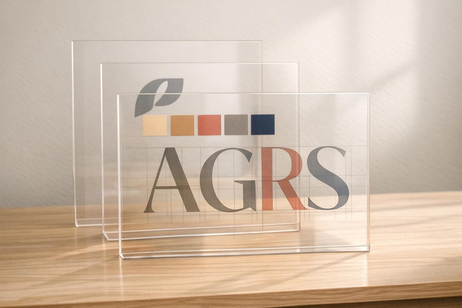
How AI Creates Custom Fonts for Brands
AI is changing how brands create custom fonts, making the process faster, cheaper, and more accessible. Traditionally, designing a font could take weeks and cost thousands of dollars. Now, AI tools can generate fonts in seconds by analyzing brand assets like logos, color palettes, and style prompts. These tools use advanced machine learning models to design fonts that match a brand’s tone, whether modern, playful, or elegant.
Key Points:
- Speed and Cost: AI reduces font creation time by 70% and lowers costs significantly compared to manual design.
- Precision: Features like auto-kerning and font interpolation ensure high-quality results.
- Impact: Companies using AI-generated fonts report a 30% increase in sales due to improved branding.
- Ease of Use: No typography expertise is needed - just upload assets and provide style prompts.
By following simple steps - defining your brand identity, uploading assets, and refining outputs - you can create fonts tailored to your brand’s needs. Pairing these fonts with matching illustrations further strengthens your visual identity across platforms.
🎬 Inside Creative Fabrica’s AI Font Generator – The Future of Typography!
How AI Font Generation Works
AI font creation leverages machine learning to transform your brand’s vision into carefully crafted letterforms. It uses advanced technologies like Generative Adversarial Networks (GANs) and diffusion models, which are trained on vast datasets of fonts. These neural networks grasp key typographic principles - such as ascender height, stroke contrast, and kerning - allowing them to design fonts that are consistent across the entire character set.
For example, if you describe a font as "friendly and rounded", the AI doesn’t just match keywords. Instead, it evaluates how visual traits relate to emotional qualities by referencing thousands of fonts. This process ensures the generated letterforms align with the tone and style you’re aiming for.
How AI Analyzes Brand Inputs
AI font generators take a deep dive into your brand assets. When you upload elements like a logo, color palette, or existing typography, the system extracts details such as letter shapes, spacing, x-height, and stroke thickness. If you provide handwritten samples, the AI can even replicate your unique writing style or adapt to a designer’s preferences over time.
The process starts with your design brief. You might share adjectives like "modern", "elegant", or "playful", alongside technical needs like file formats (e.g., WOFF2, TTF) or character sets. The AI translates these descriptions into visual design parameters. A notable example occurred in January 2026 when Skywork AI analyzed typography trends in luxury fashion to create a high-contrast serif font. This font, optimized for commercial appeal, was delivered as a complete, installable character set (OTF/TTF) in a fraction of the time traditional methods would require.
Main Features of AI Font Tools
Once the analysis is complete, AI font tools offer several standout features to streamline the design process and improve quality. These tools automate tasks that usually demand years of expertise. For instance:
- Auto-kerning: Ensures proper spacing between characters without manual adjustments.
- Font interpolation: Generates multiple weights (e.g., light, bold) from a single design, ensuring consistency across a font family.
- Vectorization and smoothing: Cleans up raw handwriting or sketches, converting them into polished, functional vector font files.
These features can save designers up to 70% of the time typically spent on font selection and refinement. Terrance Weinzierl, Creative Type Director at Monotype, highlighted the potential of AI in typography:
"I have seen exceptional, exciting, powerful pairs come from our AI that I could not have chosen by name while creating pairs".
Why Use AI for Font Creation
AI’s speed and precision make it an attractive option for font creation. It can reduce design timelines by 30% while improving overall quality by 25%. And you don’t need to be a typography expert - just having a clear vision of your brand identity is enough.
Traditional custom font design is often slow and costly, but AI tools provide a more accessible alternative. With pricing models like freemium or subscriptions, businesses of all sizes can afford professional-grade typography. Additionally, AI enables rapid prototyping and real-time tweaks, so you can experiment with multiple variations before finalizing your design.
How to Create Custom Fonts with AI
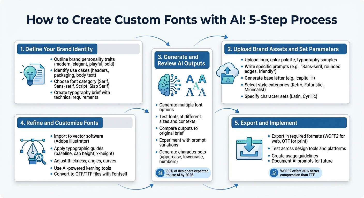
5-Step Process to Create Custom AI Fonts for Your Brand
AI makes it possible to transform your brand's identity into distinct letterforms without needing years of typography expertise. With a clear vision and the right steps, you can create a custom font that aligns perfectly with your brand.
Step 1: Define Your Brand Identity
Start by outlining your brand's personality. Write down specific traits - like modern, elegant, playful, or bold - that reflect your brand's style. These descriptors will act as a guide for the AI to create a font that matches your vision.
Think about where the font will be used most. Fonts for website headers might need to be clean and readable, while those for product packaging could be more decorative. For example, a financial firm might prefer a serious and authoritative font, while a children's brand might lean toward rounded, colorful designs.
Also, consider your audience. Choose a style that resonates with them - Serif for a classic feel, Sans-serif for a modern look, Script for a touch of elegance, or Slab Serif for a bold statement.
To stay organized, create a typography brief. Include details like your brand name, personality traits, intended use cases, technical format requirements (such as OTF or TTF), and examples of fonts or designs that inspire you. This brief will serve as a roadmap for the entire process.
Step 2: Upload Brand Assets and Set Parameters
Once your brief is ready, gather and upload visual assets like your logo, color palette, and existing typography samples to an AI platform. Make sure these files are clean and clear - tools like Remove.bg can help remove unwanted backgrounds.
Use prompts to guide the AI. For instance: "Sans-serif font with rounded edges, medium weight, friendly and approachable, for mobile app headers." Start by generating a single base letter, such as a capital H, to establish the style. Many platforms offer features like "Smart Boards" to experiment with multiple design outputs quickly.
You can also explore predefined categories like Retro, Futuristic, or Minimalist to refine the aesthetic. If your font needs to support multiple languages or specific character sets (e.g., Latin or Cyrillic), make sure to include that in your parameters. Clear instructions will result in designs that are closer to your vision.
Step 3: Generate and Review AI Outputs
Let the AI generate multiple font options based on your inputs. Review these options carefully, comparing them to your brief. Test how the fonts look at different sizes and in various contexts - what works for a headline might not suit body text. By 2026, 80% of designers are expected to incorporate AI into their workflows.
Don’t stop at the first result. Experiment with variations by tweaking your prompts. For example, adjust one descriptor at a time to see how it affects the design. Generate characters in sets (uppercase, lowercase, numbers) to maintain consistency across the font.
Once you’ve narrowed down your options, prepare to refine the selected designs.
Step 4: Refine and Customize Fonts
Bring your AI-generated letters into vector software like Adobe Illustrator for fine-tuning. Use typographic guides - such as baseline, cap height, and x-height - to ensure uniformity across characters.
Polish the details. Adjust the thickness, angles, and curves to make the font feel balanced and professional. Simplify shapes using tools like the Pathfinder to reduce file size and improve performance. While stylized fonts can add flair, ensure they remain readable, especially at smaller sizes.
Use AI-powered tools for tasks like kerning (adjusting the spacing between letters). Plugins like Fontself can help convert your refined designs into ready-to-use OTF or TTF files, saving time and effort.
Step 5: Export and Implement the Final Font
Once you’re happy with the design, export the font in the required formats. For web use, WOFF2 is ideal as it compresses better than TTF, improving page load times. For print or desktop use, OTF files are preferred for their advanced features like ligatures.
Test the font in different design tools to ensure it performs as expected. Roll it out across your organization and create clear usage guidelines. Define which weights and styles to use for specific purposes to maintain consistency - this helps establish a recognizable "visual DNA" for your brand.
Lastly, keep a record of your AI prompts and parameters. As your brand grows, you can revisit these to expand your typeface into a full family or create complementary fonts.
Combining Fonts with IllustrationsAI
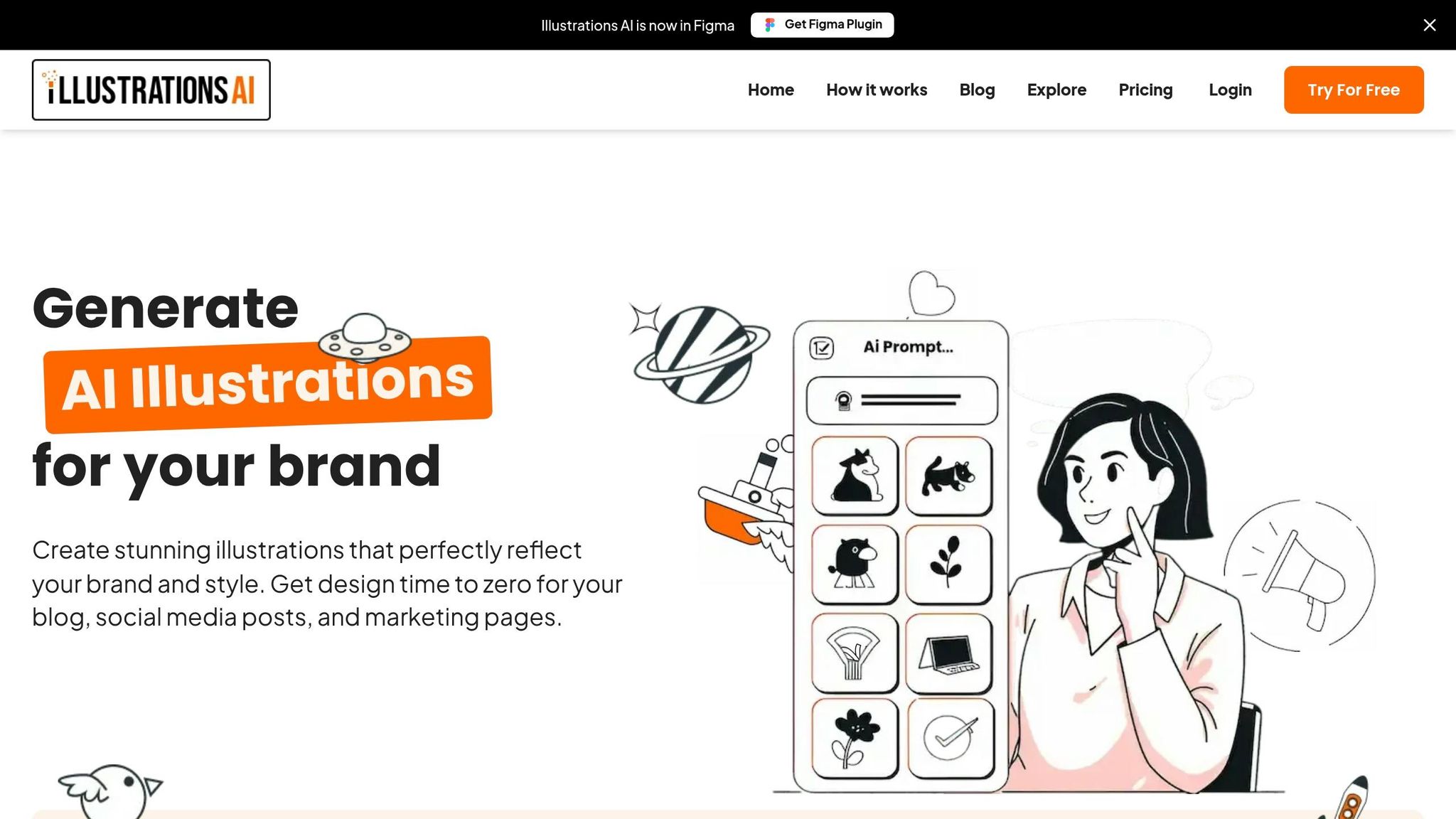
Custom fonts paired with matching illustrations can define your brand's visual identity. With IllustrationsAI, you can create custom illustrations that perfectly align with your typography's style and mood. This ensures a seamless brand presence across all touchpoints. By combining your custom font set with IllustrationsAI, you can achieve a unified and polished brand look.
Matching Fonts to Custom Illustrations
Typography and illustrations should complement each other, speaking the same visual language. Once you've refined your custom font, use a similar approach to set parameters for your illustrations. For instance, if your font is geometric and modern, opt for illustrations with clean lines and minimal detail. On the other hand, a high-contrast serif font with elegant curves pairs well with editorial-style, luxury-focused illustrations.
To achieve this alignment, define specific visual parameters like artistic style (flat, isometric, or 3D), complexity, and line treatment (outlined or filled). This ensures the AI generates illustrations that feel like a natural extension of your typography's design.
"Typography is the silent voice of your brand. The right pairing communicates personality, builds trust, and improves readability." - GetIllustrations
When generating illustrations, create them in packs rather than individually. This method ensures a consistent style seed, color palette, and visual language across all assets. For example, if you're designing a set of icons, generate them together using the same prompt parameters. IllustrationsAI allows you to create themed illustration packs, making it easier to maintain visual consistency.
A cohesive brand presentation can boost revenue by up to 23%, while unified visuals are recognized 3x faster by users compared to inconsistent designs. By ensuring your fonts and illustrations share the same mood and design principles, you create a strong visual identity that enhances brand recall.
Exporting Assets for Multi-Channel Use
Once you've created cohesive fonts and illustrations, exporting them correctly is essential for smooth implementation across various platforms. IllustrationsAI supports multiple export formats, including SVG, PNG, AI, EPS, and JPG, providing flexibility for web, print, and social media use.
For fonts, export them in WOFF2 for web and OTF/TTF for print. Pair these with SVG or EPS illustrations to ensure sharp and scalable visuals. WOFF2 offers better compression - up to 30% more efficient than TTF - helping to improve page load times.
Organize your assets with a structured naming system like [category]_[subject]_[variation]_[version].[format]. For example, you might name files header_logo_dark_v2.svg or body_font_regular.woff2. This approach ensures you can easily find and use the correct versions of fonts and illustrations, especially when collaborating with teams or managing multiple brand variations.
Before rolling out your assets, test them across platforms. Load your fonts and illustrations into your website builder, email templates, and social media designs to check for any rendering issues. This step ensures your brand looks consistent whether it's viewed on Instagram, a website, or printed materials.
Conclusion
AI is transforming typography and visual identity at a pace that’s hard to ignore. Tasks that used to take weeks - like creating entire alphabets, fine-tuning kerning, and perfecting character spacing - can now be done in less than an hour. This shift not only speeds up the process but also strengthens brand identity in ways that were once time-intensive and resource-heavy.
But it’s not just about saving time. AI-generated fonts enhance brand recognition by ensuring consistency. When your visual identity is cohesive, it sticks in the minds of consumers, making your brand more memorable and trustworthy.
Take tools like IllustrationsAI, for example. They make it easier to maintain a unified visual language across every brand channel. By following key steps - defining your brand, generating assets, and refining them - you can ensure your typography and illustrations align with the same design principles. This approach creates a polished, professional brand presence that builds trust and strengthens recall.
Whether you’re crafting your first brand consistency checklist or refreshing an established identity, start by clarifying your brand’s essence. Use AI to generate assets in batches, ensuring consistency across all platforms while keeping full control over your visual DNA. With AI, professional design becomes faster, more affordable, and completely tailored to your needs, no matter the size or stage of your business.
FAQs
To design a custom font with AI, start by uploading files that showcase the characters you want in your font. These files are usually high-quality images or vector files featuring letters, numbers, or symbols. They serve as the visual references the AI uses to study and craft your unique font.
When creating an AI-generated font, prioritizing readability across all platforms is key. Start with a design that emphasizes clarity, proper spacing, and good contrast. Leveraging AI tools with customization options can help fine-tune the font for different devices and screen sizes. It's also important to test the font in multiple contexts - whether it's on mobile screens, desktops, or print - to ensure it remains clear and functional. Regular refinements based on these tests will help maintain its usability across diverse applications.
For web, stick to formats like SVG, PNG, or JPG - these are optimized for digital screens and ensure fast loading times without compromising clarity. For print, choose high-resolution formats such as AI, EPS, or PDF. These formats maintain sharpness and detail, even when scaled to larger sizes.