
TL;DR
- How to create isometric illustrations: draw both ground axes at exactly 30 degrees from horizontal, keep the vertical axis vertical, and never let parallel lines converge.
- True isometric puts all three axes 120 degrees apart and foreshortens them equally, so a single scale measures every direction.
- The 2:1 grid used in game art sits at roughly 26.57 degrees, which makes it dimetric, not isometric — close, but not measurable the same way.
- A circle drawn on an isometric face must become an ellipse tilted into that face. Drawing a true circle is the most common beginner error.
Isometric illustration is the style that makes a flat image feel three-dimensional without any perspective. It is everywhere in SaaS marketing, infrastructure diagrams and game art for one reason: it shows three sides of an object at once and stays measurable.
It is also the style with the least room for improvisation. The whole effect rests on angles that either hold or do not.
Here is the geometry, the ellipse rule that catches everyone, and the four mistakes that make isometric work look amateur.
The geometry, in one section
Isometric projection is built on three axes and nothing else:
- The vertical axis — stays perfectly vertical. Heights are drawn straight up.
- The left cross axis — 30 degrees above horizontal, running to the left.
- The right cross axis — 30 degrees above horizontal, running to the right.
Those three sit 120 degrees apart, and all three foreshorten by the same amount. That equal foreshortening is what makes isometric measurable — one ruler works in every direction.
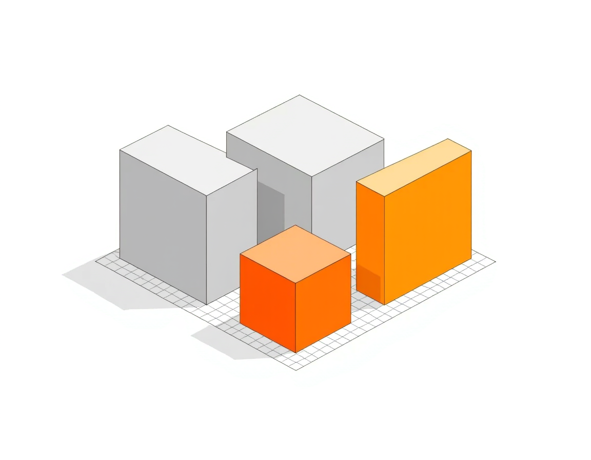
Every edge in the illustration must run along one of those three axes. There is no fourth direction available, which is the constraint that makes the style feel so orderly.
Within each face the rendering is pure flat illustration — solid fills, one tone per plane, no gradients — so the palette and shadow rules from how to create flat illustrations apply directly.
Isometric versus everything adjacent
| Projection | Ground axis angle | Vanishing points | Scales needed | Typical use |
|---|---|---|---|---|
| True isometric | 30° both sides | None | One | Diagrams, SaaS marketing, technical illustration |
| Dimetric (2:1 grid) | ~26.57° both sides | None | Two | Pixel and tile-based game art |
| Oblique / cabinet | Front face square on, side at 45° | None | Two | Quick sketches, furniture drawings |
| One-point perspective | Converging | One | Varies by depth | Interiors, cinematic scenes |
The practical difference is measurability. Isometric and dimetric drawings can be scaled off directly; a perspective drawing cannot, because size encodes distance.
Building an isometric illustration
1. Set up the grid first
Make the grid before anything else and lock it on its own layer. Working without one guarantees slow angular drift that only becomes visible once the illustration is nearly finished.
In Illustrator: draw a rectangular grid, shear it 30 degrees, then rotate it minus 30 degrees. In Figma, place two sets of 30-degree guides and duplicate along both axes.
Everything after this is vector shape work — primitives, booleans and clean paths — set out in how to make vector illustration files.
2. Start from the bounding box
Draw every object as a plain isometric cube first, sized to the object's real proportions. Only then cut into that box to make the actual shape.
Working box-first keeps proportion honest. Drawing detail first and boxing it afterwards produces objects that cannot sit next to each other convincingly.
3. Get the ellipses right
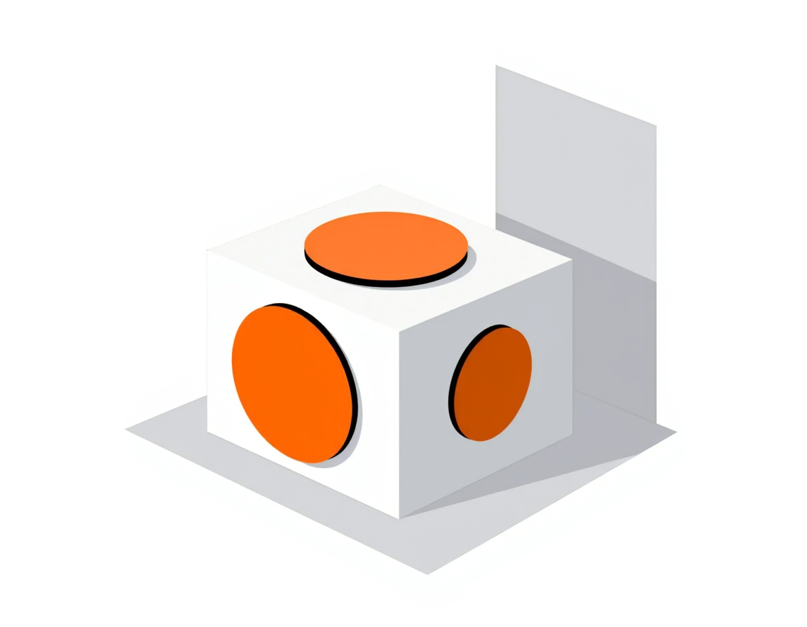
Anything round — a wheel, a cup rim, a manhole, a button — is an ellipse in isometric, and the ellipse has to lie in the plane of the face it sits on.
Practically: draw the circle, then apply the same shear and rotate you used to build the grid. Each of the three faces gets a differently tilted ellipse, and they are not interchangeable.
4. Shade by face, not by object
Assign one flat tone per axis and apply it consistently across the whole scene — for example the top face lightest, the left face mid, the right face darkest.
- Top faces — the lightest value, as though lit from above.
- Left faces — the middle value.
- Right faces — the darkest value.
Once that rule is set, depth reads automatically and you never have to make a shading decision again.
Composing an isometric scene
Single objects are the easy part. Scenes are where isometric work usually falls apart, because the projection gives you no perspective to hide overlap problems behind.
Stacking order is decided by position, not by layer
In a true isometric scene, whichever object sits lower and further right on the canvas is nearer the viewer and must draw on top.
That rule is absolute. If you find yourself reordering layers to make a scene read correctly, an object is in the wrong place on the grid.
Work in tiles
Decide one grid unit — one cube footprint — and size everything as whole multiples of it. Buildings occupy two by three units, a desk one by two, a plant one by one.
- Objects snap together without fractional gaps.
- Scenes become rearrangeable because every element shares a footprint.
- Reuse becomes trivial — a library of tiles assembles into any number of scenes.
This is exactly why isometric dominates game art and infrastructure diagrams. The tile discipline makes assets composable.
It is also why isometric suits system and workflow visuals so well: it shows layers and handoffs in one frame. For the flat-diagram alternative, see how to visualise a workflow in 5 steps.
Leave the platform edge visible
Isometric scenes read better sitting on a defined plane rather than floating. A thin extruded base gives the eye a ground reference and makes the projection legible immediately.
Without it, viewers cannot tell whether they are looking down at objects or straight at them, and the illusion weakens.
Four mistakes that break the projection
- Converging parallels. Even a two-degree drift turns a measurable drawing into weak perspective. Keep every axis strictly parallel.
- True circles on angled faces. The single most common error, and instantly recognisable.
- Scaling by distance. Isometric has no vanishing point, so a distant building is exactly the same size as a near one.
- Mixing 30° and 26.57°. Assets built on a 2:1 game grid will not align with true isometric artwork. Pick one and stay on it.
- Text drawn flat on an angled face. Type either gets sheared into the face along with everything else, or sits outside the scene as a label. Half-sheared text looks like a mistake.
All five share a cause. Isometric is a measuring system pretending to be a drawing style, and anything that breaks the measurement breaks the illusion with it.
The quickest way to catch a problem is to extend any two supposedly parallel edges off the canvas and see whether they stay apart. If they meet, the projection has drifted.
Exporting isometric work
Isometric illustration is almost entirely straight edges and flat fills, which makes it close to ideal for vector export — small files and perfectly crisp diagonals at any size.
SVG is the right default here, and it carries around 99% browser support; the format trade-offs are covered in SVG vs PNG for web illustrations.
One caveat: long diagonal edges are where anti-aliasing artefacts show up worst in raster exports. If you must ship PNG, export at 2× and scale down.
Generating isometric work with Illustrations AI
Isometric is the one technical style where a generator is genuinely strong, because the projection is a rendering convention rather than exact measurement. Our isometric styles hold the 30-degree axes and keep parallel edges parallel, which is precisely what breaks when people draw it by hand.
- Scenes and hero art — buildings, platforms and stacked systems come back correctly projected in under 20 seconds.
- Consistent tile sets — one locked style means twenty objects share the same axis angles and face shading, so they sit together in a scene.
- Full commercial rights on everything, with no credit card needed to start.
Where it still will not help: exact measurable drawings, labelled text inside the image, and precise tile snapping. For those, generate the scene as a reference and rebuild the geometry on your locked grid.
Try the isometric generator, or start from the wording patterns in 60 AI illustration prompts.
Let the grid do the work
Set the grid, box every object, tilt every ellipse into its face, and shade by axis. Those four habits account for nearly all the difference between isometric work that looks deliberate and isometric work that looks slightly off.
Generate isometric illustrations free — each option is created in under 20 seconds with full commercial rights, and no credit card is required to start.
FAQs

Meet the Author
Vignesh Rao Y
Vignesh is driven by ideas that create a tangible impact. At Illustrations AI, he specializes in content that helps designers and marketers speed up their creative workflows. When he's not turning complex ideas into simple visuals, you might find him lost in a book, jotting down ideas in his notebook, or connecting the dots others overlook.