TL;DR
- How to create flat illustration work: build the subject from geometric primitives, commit to one shadow treatment, restrict the palette to five colours, and keep line weight uniform throughout.
- Nobody ships pure Flat 1.0 today — the working standard is Flat 2.0, which adds subtle shadows back to restore depth cues without returning to skeuomorphism.
- Flat is the default illustration style because it stays legible at icon size and exports to small SVG files.
- Its known weakness is affordance: flat elements give no signal that they are clickable, which is exactly the problem Flat 2.0 was created to solve.
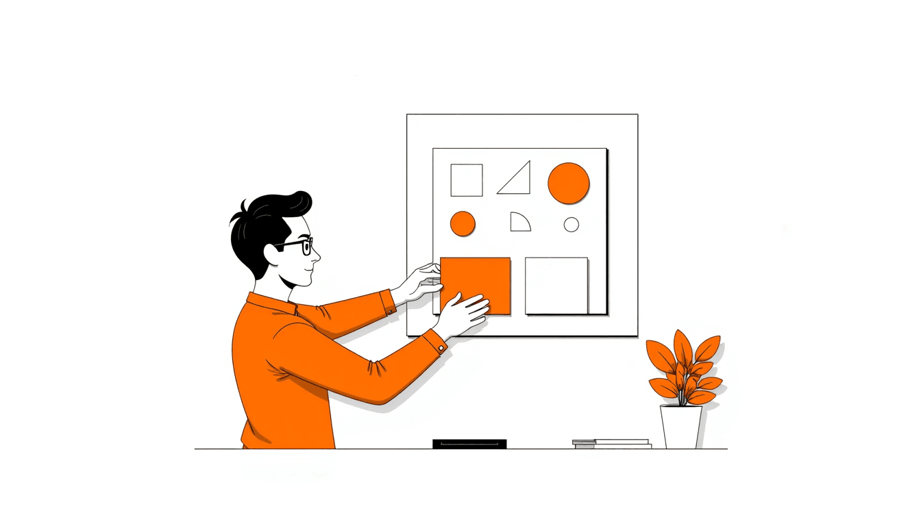
Flat illustration looks easy because there is so little in it. That is also why it is unforgiving — with no texture or rendering to hide behind, every shape and colour decision is visible.
The style emerged as a reaction against skeuomorphism, the era of leather-textured calendars and glossy buttons. Stripping that away made interfaces faster and cleaner, and introduced one real problem.
Below are the rules that make flat work read properly, the shadow question that defines which era of flat you are in, and the situations where flat is the wrong choice.
Flat 1.0, Flat 2.0 and Material
"Flat" covers several distinct styles that differ mainly in how they handle depth.
| Style | Shadow treatment | Depth cue | Best for | Main risk |
|---|---|---|---|---|
| Skeuomorphic | Heavy, literal, plus texture and bevel | Simulated real-world materials | Nostalgia pieces, niche brand work | Dates almost immediately; heavy files |
| Flat 1.0 | None at all | Colour and scale only | Icon sets, editorial spot art | No affordance — readers miss interactive elements |
| Flat 2.0 | Subtle drop shadows and highlights | Slight z-axis layering | Product UI, marketing pages | Shadow inflation as everything competes to sit on top |
| Material | Systematic, driven by elevation values | Consistent borrowed physics | App interfaces needing a strict system | A much larger spec to follow correctly |
Nielsen Norman Group's critique of the original flat wave is the clearest statement of the trade-off: removing every depth cue also removes the signals telling people what they can interact with.
Flat 2.0 keeps the speed and clarity of minimalism while putting just enough dimensionality back to fix that.
Flat is also the style that carries brand recognition most efficiently, because a restricted palette and one stroke weight are instantly repeatable — the evidence for that is in how illustration styles boost brand recognition.
The five rules of flat illustration
1. Build from primitives
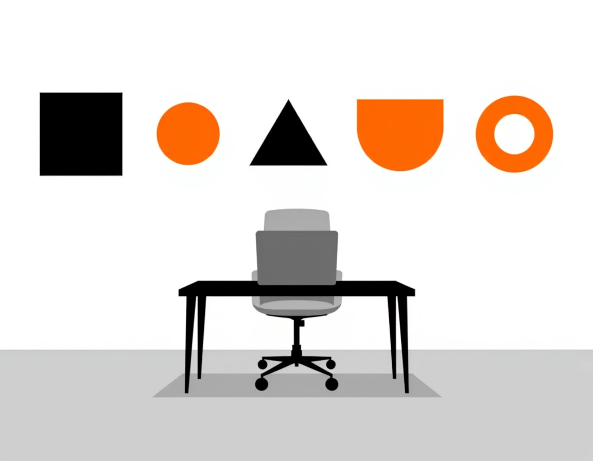
Flat subjects decompose into a handful of basic shapes. A house is a square and a triangle. A coffee cup is a tapered rectangle, a half-ring and an ellipse.
Place the primitives, then combine them with union, subtract and intersect. If a subject needs more than about six shapes, simplify the subject rather than adding a seventh.
Those three boolean operations do most of the work in flat illustration, and the SVG workflow covers how to apply them without touching the pen tool.
2. One light source, or none
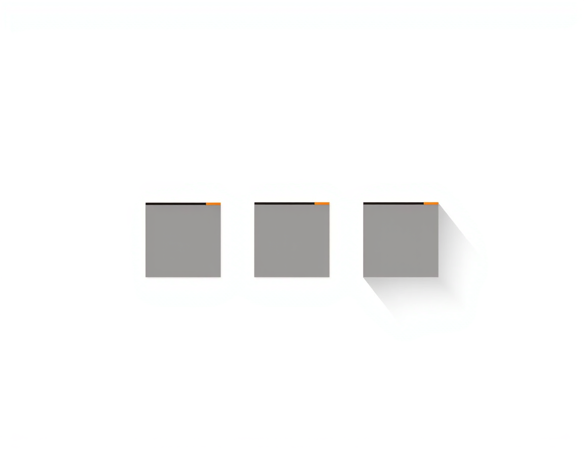
Decide the shadow rule once for the whole set. No shadow at all is a valid choice. A tight shadow directly beneath every object is a valid choice. A long 45-degree shadow is a valid choice.
What breaks an illustration is mixing them — one object lit from the left, another from above, a third with no shadow. Readers cannot articulate why it looks wrong, but they see it.
- No shadow — icons, dense diagrams, anything reproduced very small.
- Tight shadow — UI illustration where layering carries meaning.
- Long shadow — editorial and marketing art with room to breathe.
3. Restrict the palette
Flat illustration has no texture to create variation, so colour does all the separating. That makes an unrestricted palette much more damaging here than in rendered styles.
Five colours is the working limit — one dominant, one secondary, one accent, two neutrals — the same discipline we set out in the six-step illustration workflow.
Test in greyscale before shipping. Two shapes with different hues but identical luminance will merge into one silhouette for a significant share of readers.
Locking those five colours into a written spec is what stops the palette drifting across a set — the brand consistency checklist is the short audit for it.
4. Let negative space carry the detail
Because flat work cannot use shading to describe form, the gap between shapes has to do that job. A cut-out sliver reads as a highlight; a notch reads as a seam.
This is why flat illustration rewards subtraction. Removing a shape to imply an edge is almost always cleaner than adding a line to draw it.
5. Keep line weight uniform
If the style uses outlines, pick one stroke weight and use it everywhere, including on small details where the temptation to go thinner is strongest.
Expand strokes to outlines before export, or scaling the artwork will leave the lines at their original width while every shape around them grows.
Flat illustration changes with size
The same artwork does not survive every size. A flat illustration built for a hero section loses its meaning entirely at 24 px, and an icon blown up to hero size looks empty.
Work out which of three size bands the illustration is for before starting:
- Icon, 16–32 px — one shape, no interior detail, no shadow. The silhouette is the whole design.
- Spot illustration, 100–300 px — three to six shapes, one accent colour, optional tight shadow.
- Hero, 600 px and up — a full scene, background elements, and room for a long shadow.
Designing one asset and scaling it across all three bands is the most common flat-illustration mistake in production. Build a separate version per band and share only the palette and stroke weight between them.
A quick check: shrink the illustration to 32 px and squint. Whatever survives is the actual design; everything else was detail you can afford to lose.
Where flat illustration is the wrong choice
Worth being straight about the limits rather than treating flat as a universal default.
- Material and texture matter. Fabric, food, skin and timber lose their point when flattened to solid fills.
- Depth is the subject. If the point is spatial relationship or layered systems, isometric projection shows three sides at once where flat shows one.
- Photoreal accuracy is required. Medical, technical and product-fidelity work needs rendering, not abstraction.
- Interactive affordance is critical. A flat button is a rectangle. Add elevation or a border.
- Emotional nuance is the brief. Flat faces carry limited expression, which is why flat characters trend toward friendly neutrality.
Generating flat illustrations with Illustrations AI
Flat is the style AI generators handle best, because solid fills and hard edges are far more forgiving than gradients or texture.
- Name the shapes, not the mood. "A house built from one square and one triangle" beats "a modern home illustration".
- State the shadow rule in the prompt — "soft long shadows" or "no shadows" — and reuse that phrase on every image in the set.
- Name the palette explicitly rather than asking for something pleasant.
- Add negatives. Generators add people, plants and desks uninvited unless told not to.
This is where a generator genuinely helps rather than just feeling fast. Our flat 2D illustration generator returns a finished option in under 20 seconds with full commercial rights, and holds the same line weight and shading rules across every result — so the four decisions above are made once and then enforced automatically.
That consistency is the hard part of flat work by hand. Twenty illustrations drawn over three weeks drift; twenty generated from one locked style do not.
Ready-made wording for each surface is in 60 AI illustration prompts, and the wider six-step method is in how to make illustrations.
Decide the rules, then draw
Flat illustration is a set of constraints more than a drawing technique. Fix the primitives, the shadow rule, the five colours and the stroke weight before you make the first shape.
Those four decisions are what make ten separate illustrations look like one person made them.
Write them down somewhere the whole team can see — the five hex codes, the stroke weight in pixels, the shadow rule, and the maximum shape count. That short document is worth more than any single illustration it produces, because it is what keeps the twentieth asset consistent with the first.
Then start with the smallest size you need. If the idea survives at 32 px, it will survive everywhere else.
FAQs

Meet the Author
Vignesh Rao Y
Vignesh is driven by ideas that create a tangible impact. At Illustrations AI, he specializes in content that helps designers and marketers speed up their creative workflows. When he's not turning complex ideas into simple visuals, you might find him lost in a book, jotting down ideas in his notebook, or connecting the dots others overlook.