TL;DR
- How to create a logo using AI: describe the mark type, subject, style and colour in one prompt, generate twenty or more options, then vectorise and refine the one that still works at 16 px.
- AI-generated logos can be registered as trademarks — the USPTO does not evaluate who or what created a mark — but a logo you only prompted and accepted is not eligible for US copyright.
- Generators return raster images by default. A production logo has to end up as SVG so it holds from a favicon to a trade-show banner.
- AI is fast at exploring directions and unreliable at typography, so plan to set the type yourself in a vector editor.
Knowing how to create a logo using AI saves the two things a small team rarely has: a designer's retainer, and three weeks of revision rounds.
What it does not save you from is judgement. A generator will hand you fifty plausible marks in a minute. Choosing the one that survives a favicon, a single-colour print and ten years of use is still your job.
This guide covers the mark types AI handles well, the prompt structure that works, the file conversion most guides skip, and what you can legally protect at the end.
The five kinds of logo mark
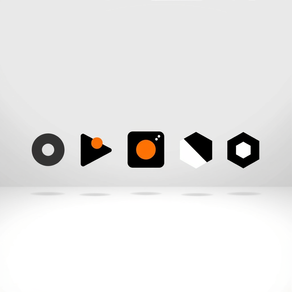
Before prompting anything, decide what kind of mark you are asking for. Generators respond very differently to each.
| Mark type | What it is | Best for | How reliably AI handles it |
|---|---|---|---|
| Wordmark | The company name set in distinctive type | Short names worth reading in full | Poor — letterforms come out warped or invented |
| Lettermark or monogram | One to three initials | Long names, tight spaces | Poor to fair — the same typography problem |
| Pictorial mark | A recognisable object, simplified | Concrete, nameable brands | Strong |
| Abstract mark | A non-representational geometric form | Categories with no obvious object | Strong |
| Combination mark | Symbol and wordmark locked together | Most businesses | Generate the symbol, set the type yourself |
The pattern is consistent. Generate symbols with AI; set type in a vector editor. Text inside generated images is still the weakest part of every model.
Because the symbol has to survive at every size, most successful marks are flat and geometric — the shape and shadow rules for that are in how to create flat illustrations.
A prompt structure that works
Five parts, comma separated, in this order:
- Mark type — "a minimal pictorial logo mark".
- Subject — the object or idea, stated plainly.
- Style — geometric or organic, line-only or solid fill, one stroke weight.
- Colour — two colours maximum, named explicitly.
- Constraints — "flat, centred, no text, plain background".
Generate in volume before you judge anything. Twenty options cost about a minute and stop you committing to the first competent result you see.
The five-part structure here is a shortened version of the general prompt formula. If you want the long form plus ready-made examples, see 60 AI illustration prompts.
Three prompts to start from
Concrete examples travel further than a template. Each of these follows the five-part order above:
- Pictorial — "a minimal pictorial logo mark, a folded paper bird, geometric with straight facets and one stroke weight, deep indigo on white, flat, centred, no text, plain background".
- Abstract — "an abstract logo mark, two interlocking arcs forming an implied circle, even stroke weight with rounded caps, single teal, flat, centred, no text, plain background".
- Pictorial, organic — "a minimal pictorial logo mark, a coffee bean rendered as one continuous curve, solid fill with a single negative-space gap, warm brown, flat, centred, no text, plain background".
Notice what is absent: no adjectives about being modern, trustworthy or innovative. Those words give the model nothing to place on the canvas and quietly waste prompt budget.
Turning a generated image into a usable logo
This is the step most AI logo guides skip, and it decides whether the mark is actually usable.
- Vectorise it. Run the raster output through Image Trace in Illustrator or Trace Bitmap in Inkscape, then delete stray anchor points by hand — a curve needing eleven anchor points usually needs three, and the SVG workflow covers the cleanup properly.
- Rebuild the geometry. Circles should be actual circles. Redraw near-symmetrical curves with real shape tools.
- Set the type yourself. Choose a typeface, correct the kerning, and lock the spacing between wordmark and symbol.
- Export the whole family. SVG for web, transparent PNG for slides, single-colour PDF or EPS for print and merchandise.
Format matters more for a logo than for any other asset. A basic 24×24 px icon can be about 2 KB as an SVG but roughly 15 KB as a PNG, and SVG carries around 99% browser support — the full comparison is in SVG vs PNG for web illustrations.
Four tests before you commit
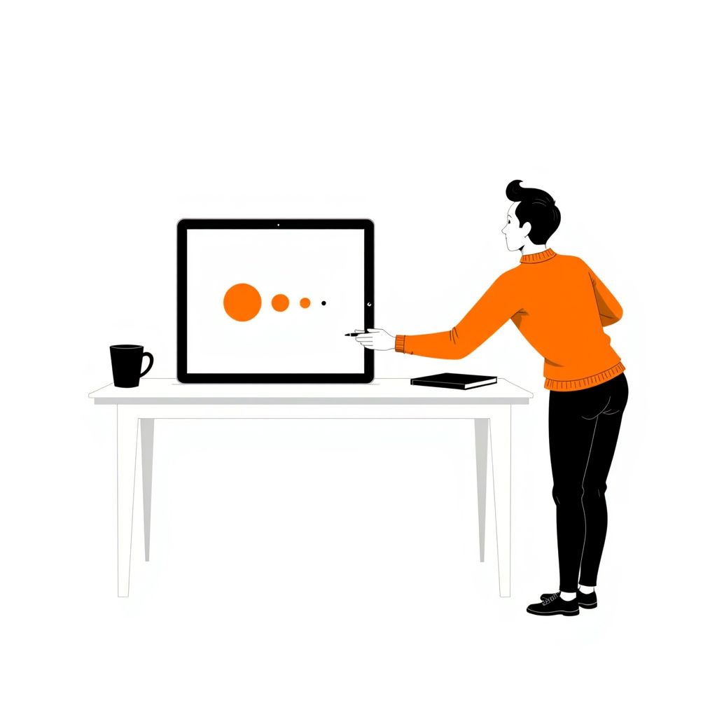
- The 16 px test — shrink it to favicon size. If the shapes merge into a blob, simplify and try again.
- The one-colour test — flatten it to solid black. A mark that only works in gradient is not a logo.
- The squint test — blur it until detail disappears. The silhouette should still be distinct from your competitors.
- The reproduction test — imagine it embroidered, engraved and photocopied. Hairline strokes vanish in all three.
What you can actually own
Worth settling before the mark goes anywhere near a contract, because trademark and copyright give very different answers here.
Trademark: yes. The USPTO evaluates whether a mark is distinctive, used in commerce, and not confusingly similar to an existing registration. It does not evaluate who or what created it, so an AI-generated logo can be registered.
Copyright: usually not. The US Copyright Office has consistently held that material produced by an AI system without meaningful human creative contribution is not registrable. A logo you prompted and accepted unchanged falls outside protection.
Substantially editing the output — vectorising, recomposing, redrawing — restores copyright in the human-authored elements. That is one more reason not to ship raw generator output.
This is general information rather than legal advice. Check with an attorney before you file anything.
What ships alongside the mark
A logo on its own is not a deliverable. What a designer would normally hand over — and what you now have to assemble yourself — is a small set of files and rules.
- Primary lockup — symbol and wordmark in their fixed relationship, with the spacing between them locked.
- Secondary lockups — a stacked version for square spaces and a symbol-only version for avatars and favicons.
- Clear space rule — a defined minimum margin, usually expressed as a fraction of the symbol's height.
- Minimum size — the smallest width at which the mark stays legible, stated in pixels for screen and millimetres for print.
- Colour variants — full colour, solid black, solid white for dark backgrounds.
Half an hour spent writing these rules down prevents the slow drift where every team member scales and recolours the logo slightly differently.
The logo is only one asset in that system. Our brand guidelines guide covers the wider document, and the brand consistency checklist is the short version to audit against.
Where AI logo generators fall short
- Typography — letterforms come out distorted or invented. Set type separately, every time.
- Exact geometry — precise grids, angles and optical alignment need a vector editor.
- Clearance — a model cannot tell you that a similar mark is already registered in your trademark class.
- Positioning — a generator has no view on your strategy. It renders what you asked for, confidently.
Exploring marks with Illustrations AI
The expensive part of logo design is exploration — producing enough genuinely different directions to know which one is right. That is the part worth automating.
- Volume in minutes. Each option is created in under 20 seconds, so twenty candidate marks is a coffee break rather than a week of revisions.
- One style across the set. Locking a style means the twenty options are comparable — you are judging the idea, not the rendering.
- Full commercial rights on everything you generate, with no credit card needed to start, so you can explore before committing to anything.
Be clear about the boundary though: use it for the symbol and the exploration, then set the type and rebuild the geometry yourself. A mark you prompted and accepted unchanged is also a mark you cannot copyright, which is the trade-off covered above.
Start with twenty options, not one
Write the five-part prompt, generate twenty marks, and throw away nineteen. Vectorise the survivor, set the type, then run the four tests.
That loop takes an afternoon and leaves you with a mark you can register, reproduce and actually ship.
Generate bold single-colour marks free — each option is created in under 20 seconds, you get full commercial rights, and no credit card is required to start.
FAQs

Meet the Author
Vignesh Rao Y
Vignesh is driven by ideas that create a tangible impact. At Illustrations AI, he specializes in content that helps designers and marketers speed up their creative workflows. When he's not turning complex ideas into simple visuals, you might find him lost in a book, jotting down ideas in his notebook, or connecting the dots others overlook.