TL;DR
- How to make illustrations without drawing skills: build them from geometric shapes, or generate them from a text prompt and edit the result.
- The workflow is identical in every tool — brief, references, thumbnails, one style, five colours, then the right export.
- Three routes get you to a finished file: draw by hand, build from vector shapes, or generate with AI. They differ in skill floor and turnaround, not in ceiling.
- Export decides how the illustration performs: SVG for flat vector work on the web, PNG for texture or transparency, 300 DPI CMYK for print.
Most people searching for how to make illustrations are not trying to become illustrators. They need one good visual for a landing page, a deck or a blog post, and they need it this week.
The hard part of illustration is not drawing. It is deciding what the image has to say, then holding a single visual style while it says it. Those are decisions, not motor skills.
Below is the six-step workflow illustrators actually follow, then a comparison of the three routes to a finished file so you can pick the one that fits your deadline.
The six steps of making an illustration
These steps do not change whether you are working in Procreate, Adobe Illustrator, Figma or a prompt box. Skipping them is what makes an illustration look amateur.
1. Write a one-line brief first
Before you open any tool, finish this sentence: this illustration exists so that a reader understands X on Y surface.
Being that specific kills the two most expensive mistakes in illustration — drawing the wrong thing beautifully, and drawing the right thing at the wrong size.
2. Collect references, not inspiration
Nine reference images, three jobs:
- Three for composition — how the elements are arranged in the frame.
- Three for style — line weight, shading, level of detail.
- Three for colour — the palette you will hold yourself to.
A folder of two hundred saved pins is not a reference board. It is procrastination with a mood board attached.
3. Thumbnail the composition before you commit
Draw the same idea six times at postage-stamp size, roughly 3 cm wide. At that scale you can only record the silhouette and the focal point — which is exactly what you are testing.
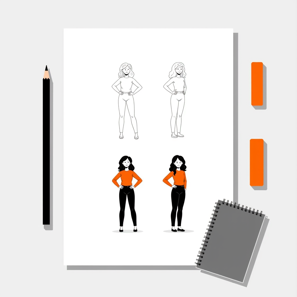
Keep the thumbnail that still reads when you squint at it. Negative space does more work than detail here, and a composition that fails small will not be rescued by rendering it large.
4. Lock one style and do not mix
Pick a single style axis and hold it: flat, isometric, line art, or textured. Mixing two in one image is the most common reason a competent illustration still looks unresolved.
Each axis has its own rules. Flat work lives or dies on a five-colour palette and one shadow direction — the specifics are in how to create flat illustrations. Isometric is stricter still: both ground axes sit at exactly 30 degrees, covered in the 30° grid explained.
Commit to specifics rather than vibes — one line weight, one shadow direction, one level of detail, one perspective family.
If you want to see what that discipline looks like in practice, our flat 2D illustration generator returns a finished illustration in under 20 seconds, and every option it gives back shares the same line weight and shading rules.
5. Restrict the palette to five colours
- One dominant — covers the largest area.
- One secondary — supports the dominant, roughly a third of the area.
- One accent — used once, on the focal point.
- Two neutrals — background and shadow.
Check the palette in greyscale before you colour anything. If the shapes disappear once hue is removed, the problem is contrast, and adding more colours will not fix it.
6. Export for the surface, not for your desktop
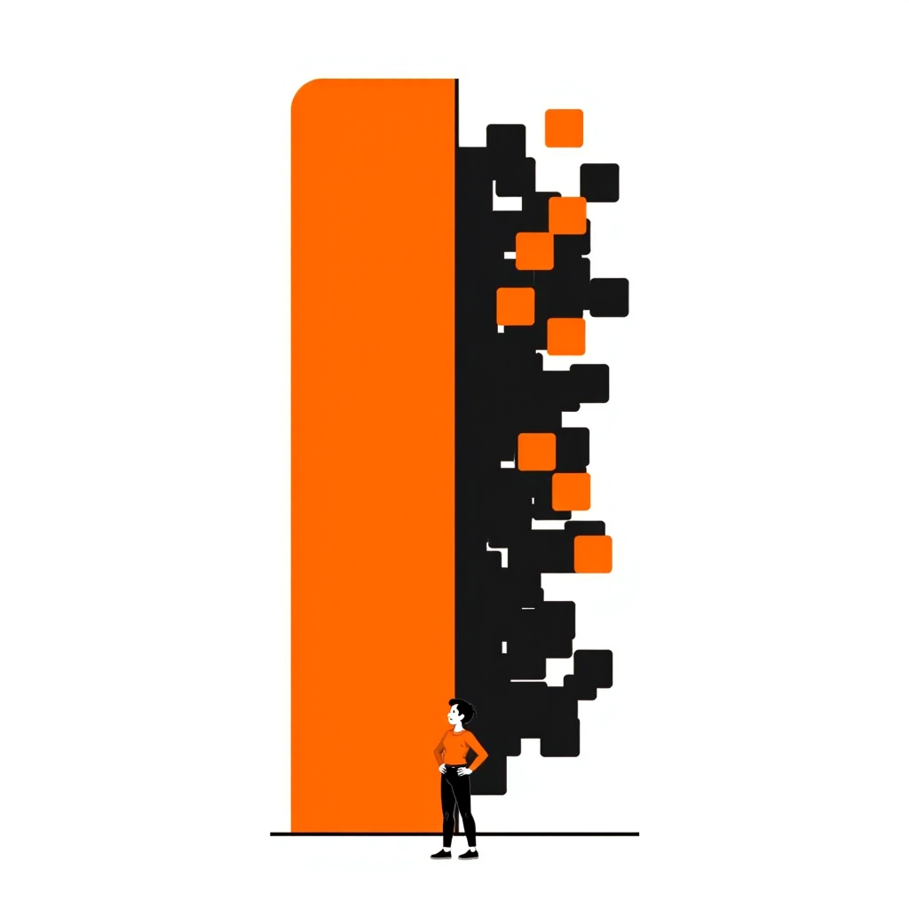
Vector formats store shapes as maths, so edges stay crisp at any size. Raster formats store a grid of pixels, so enlarging them breaks the edge apart.
- SVG — flat vector work on the web: logos, icons, spot illustrations.
- PNG — anything with texture, gradients or transparency.
- WebP — large web illustrations where file weight matters more than editability.
- 300 DPI CMYK PDF or TIFF — print.
Format is not a detail. A basic 24×24 px icon can be about 2 KB as an SVG but roughly 15 KB as a PNG — we break the full trade-off down in SVG vs PNG for web illustrations.
Three routes to a finished illustration
All three produce publishable work. They differ in what they demand from you, not in whether the result can be good.
| Route | Skill floor | Typical turnaround | Best for | Main trade-off |
|---|---|---|---|---|
| Draw by hand (Procreate, paper and scan) | High — you need to draw | Hours to days per image | Character work, editorial, anything carrying personality | Slowest, and hardest to keep consistent across a set |
| Build from vector shapes (Illustrator, Figma) | Low to medium — no drawing needed | 1–3 hours per image | Flat, isometric and geometric work; icons; diagrams | Rigid — organic subjects come out stiff |
| Generate from a prompt (AI) | Low — you write, not draw | Under a minute per option | Concept visuals, blog and landing page art, style exploration | Needs editing; weakest on text, hands and exact layouts |
Most teams end up mixing routes: vector shapes for diagrams that have to be exact, AI generation for concept and editorial visuals, and hand-drawn work reserved for the few assets that carry the brand's personality.
If you take the vector route, most flat artwork is two primitives and one boolean operation — the full workflow is in how to make vector illustration files. If you take the AI route, the prompt does the work, and we keep 60 ready-made illustration prompts grouped by use case.
How to make illustrations when you cannot draw
Two approaches remove the drawing requirement entirely.
Build from shapes. Almost every flat illustration decomposes into rectangles, circles and triangles with corners rounded and edges trimmed. Stack them, align them, and use the pen tool only to join what you have already placed.
Take a laptop on a desk. That is a trapezoid for the screen, a second trapezoid mirrored beneath it for the keyboard plane, a thin rectangle for the desk edge, and one ellipse behind everything for the shadow. Four shapes, no drawing.
A coffee cup is a tapered rectangle, a half-ring for the handle, an ellipse for the rim, and two soft curves for steam. A plant is one rectangle for the pot and five rounded triangles fanned from a single point.
The skill you are actually building is seeing subjects as shape counts. Once a subject is under six shapes, drawing ability stops being the constraint and composition takes over.
Describe instead of draw. Write the subject, composition, style, colour direction and background as a single prompt, generate several options, then edit the closest one.
Either way the six steps still apply. A prompt is a brief, and an unbriefed prompt produces exactly the same vague result an unbriefed sketch does.
Where AI illustration is the wrong tool
Worth being honest about the limits, because ignoring them wastes more time than drawing by hand would have.
- Diagrams with labelled parts — text inside generated images is still unreliable. Generate the artwork, then set the labels in Figma. For workflow diagrams specifically, four shapes carry almost everything: see how to visualise a workflow in 5 steps.
- Logos and trademarks — a mark has to be deliberately authored and legally distinctive.
- Exact layouts — if a shape must sit at a precise coordinate, use vector tools.
- Likenesses of real people — a consent and rights problem before it is a craft problem.
Doing this with Illustrations AI
The six steps above are tool-agnostic, but three of them are where a generator actually saves time rather than just feeling faster.
- Step 3, thumbnailing. Instead of sketching six compositions, describe six and generate them. Each option takes under 20 seconds, so exploring the full set costs about two minutes.
- Step 4, holding one style. This is the part teams get wrong by hand. Pick a style once and every image you generate inherits the same line weight, shading and palette — which is the whole reason a set looks like one designer made it.
- Step 6, export. Everything comes back web-ready with full commercial rights, so there is no licensing step between generating and shipping.
What it will not do is replace steps 1 and 2. An unbriefed prompt produces the same vague result an unbriefed sketch does, and no generator can decide what your illustration is for.
If you are starting from zero, the beginner's guide to the AI illustration generator walks through the interface itself.
Start with one illustration, not a system
Pick the single visual you actually need this week. Write the one-line brief, thumbnail it six times, choose one style, hold five colours, and export it for the surface it will live on.
Then reuse those decisions on the next one. That repetition is what turns a pile of images into a recognisable style.
Generate your first illustration free — no card required, and the style stays consistent across every option.
FAQs

Meet the Author
Vignesh Rao Y
Vignesh is driven by ideas that create a tangible impact. At Illustrations AI, he specializes in content that helps designers and marketers speed up their creative workflows. When he's not turning complex ideas into simple visuals, you might find him lost in a book, jotting down ideas in his notebook, or connecting the dots others overlook.